WorkForce West Virginia Website Redesign
Overview
This redesign of WorkForce West Virginia’s website was meant to improve the site’s readability and ease of use as many state unemployment sites tend to have poor navigation and are quite cluttered.
Background
This project was started in October 2022 and ended in November 2022 as my part of a UI/UX bootcamp associated with UCI’s continuing education program. Our class what separated into teams of 4 and tasked with redesigning 1 of 5 state unemployment websites. This was the second project done as part of the UI/UX bootcamp and my group all shared the responsibility of each task evenly.
Some key achievements made throughout this project were:
Successfully redesigned and improved an existing site. Although I had built up a good amount of experience by this point, this was my first time redesigning an existing site. Rather than building something from the ground up, my group and I had to improve on something that was already designed.
Incorporated use of AutoLayout. During the course of this project, I was able to learn how to incorporate AutoLayout in my designs which made organizing content a much easier and more logical process. As much of the content on sites is organized by grids and held within boxes, AutoLayout is able to evenly space and align everything.
Collaborated with various age groups. I have worked with a diverse group of people in the past, however, this was the first time I had worked with people a lot older than I was and it was such a pleasure. As two of my group members had much more job and life experience than I, I was able to gain a lot of experience and knowledge from them.
The Challenge
The redesign challenge my group and I decided to take on was redesigning the WorkForce West Virginia (WFWV) Unemployment website. We decided to redesign the WFWV website because we thought that out of all of the websites available to choose from, it was the one that needed the most work.
Research / Low Fidelity wirefrmaes
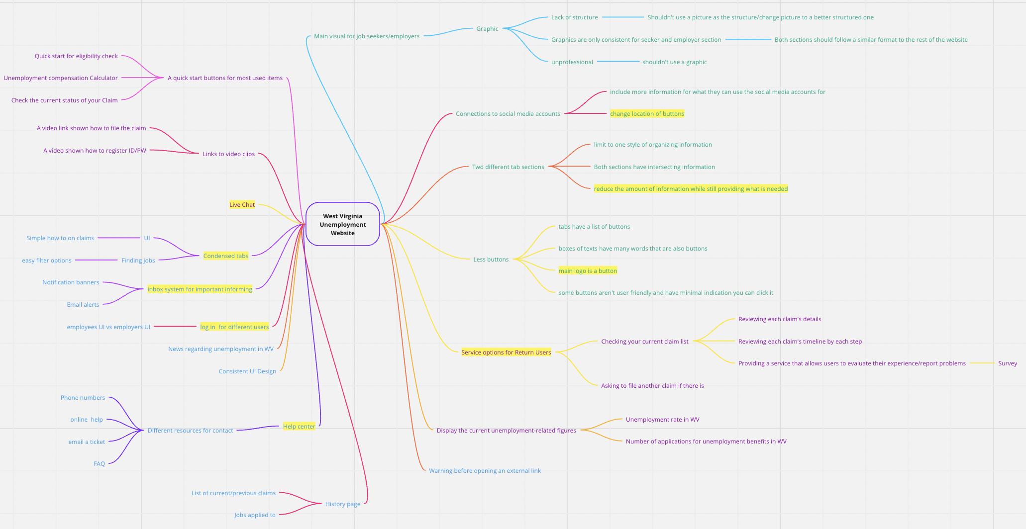
My team and I started out by creating a mind map to give us an idea of what core features of the website needed improvement. During this mind mapping session my team and I used divergent thinking in order to come up with as many ideas as possible for how we could improve the site.
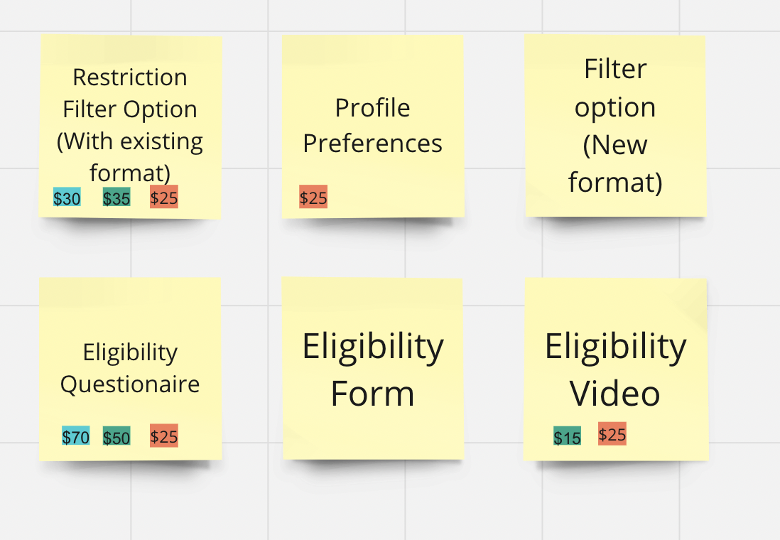
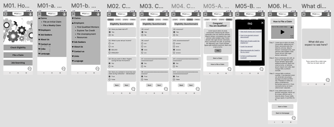
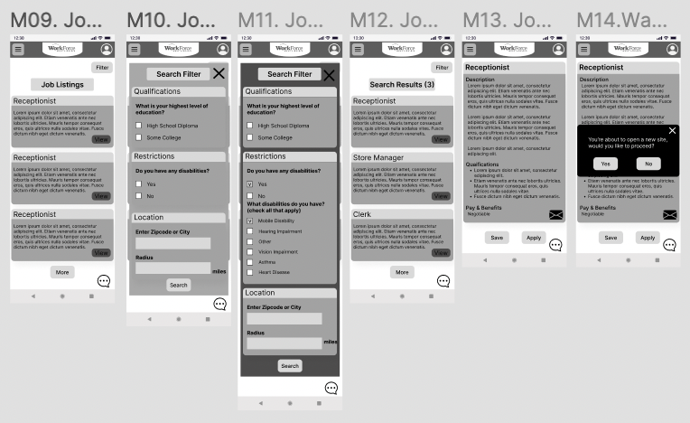
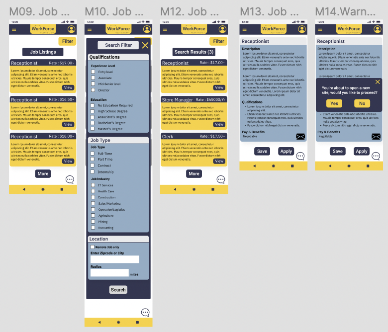
We then switched to our converge phase by using a $100 dollar bill test. In this test, each member in the team would have an imaginary $100 dollars that they can use to allocate resources to a specific feature they would like to improve. From this test we concluded we should move forward by focusing on creating a restriction filter option and eligibility questionnaire since they had the most investment put into them.
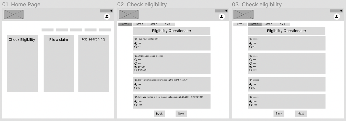
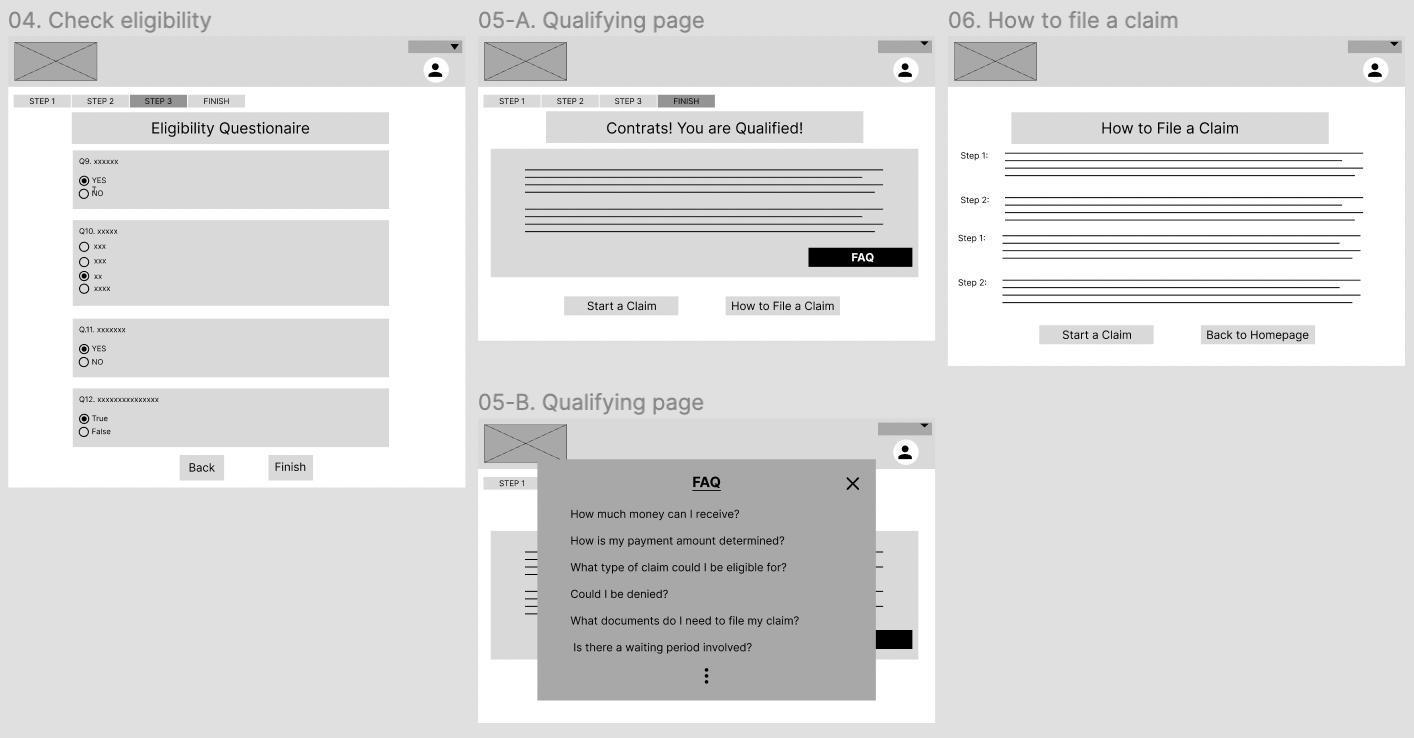
With these two features being our focal point, we decided to create some low fidelity wireframes for them.
At this point we needed to work on the navigation of the website which we knew would take a significant amount of time considering how many buttons and links the site had. Considering this, we started by creating a content inventory and audit. This allowed us to list out all the existing content the site had and determine how urgent something was to fix.
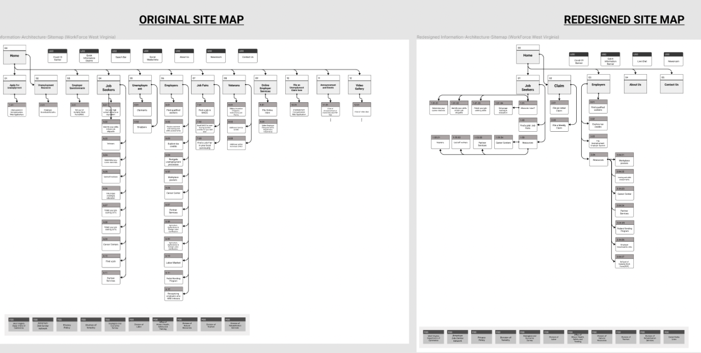
We continued our simplification of the navigation by creating a site map for the existing site and heavily restructuring it to reduce how many pathways there were.
Once our sitemap was finished we worked on creating low fidelity wireframes for our navigation bar.
Mid-Fidelity Wireframes
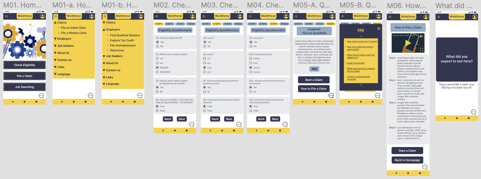
Now that we had our low fidelity wireframes completed, we updated them to mid-fidelity wireframes to prepare them to be styled.
We also decided to create a mobile version which would serve as the version we styled moving forward. We made this decision because we thought more people would be viewing the site on a mobile device.
Style Guide / accessibility
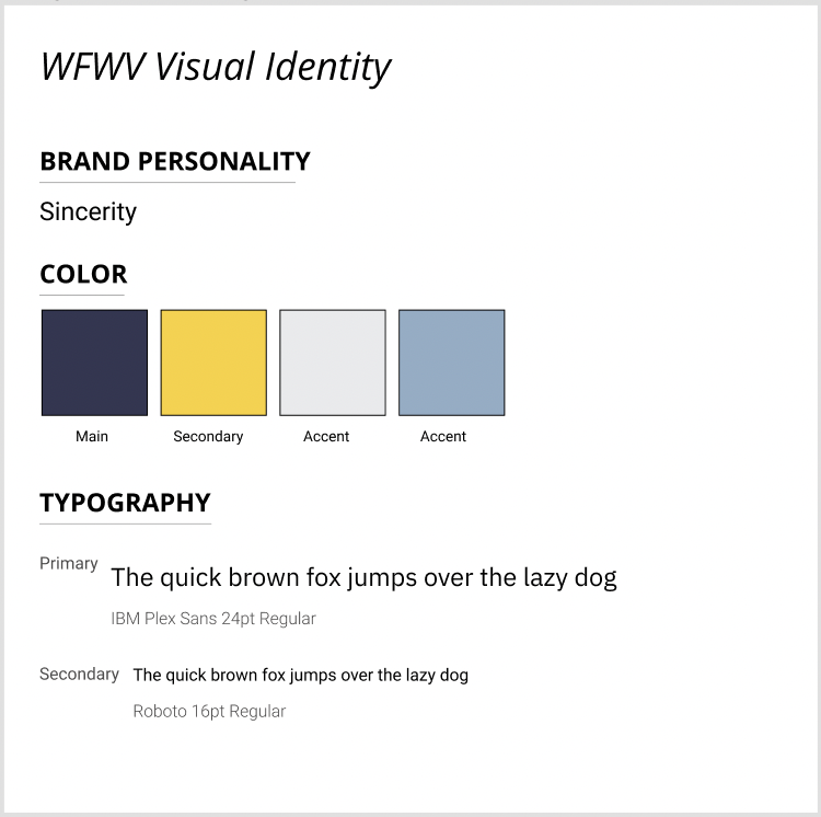
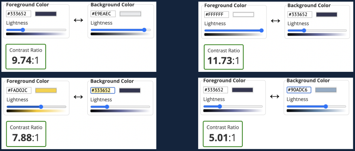
Before improving our wireframes to high fidelity wireframes we created a style guide to match our brand personality. Fortunately we found that West Virginia’s state colors blue and gold imparted feelings of confidence, trust, and success which were all things we wanted to evoke from our users. As for our accent colors, we chose them because of the they had good contrast with our primary and secondary colors, making text easy to read. Similarly, we chose our fonts because they were simple and easy to read which we thought would be helpful considering the site attracts in a diverse group of people.
High-fidelity Wireframes
With our style guide finished we applied our colors and fonts to our mid fidelity wireframes to bring them to life.
Prototype
Once the high fidelity wireframes were completed, we added functionality to each frame to create our prototype.
Results and Takeaways
This project was extremely rewarding in terms of skills I gained while using Figma. There was extensive use of the program to create the desktop and mobile versions of the redesign which allowed for lots of time to get comfortable with the programs intricacies.
Some key takeaways I have from this project are:
Design with reason. This project was the first project I was introduced to style guides and brand personalities. With this concept in mind I was able to see how everything that goes into a design can relate back to the brand personality to create a product that invokes a coherent feeling or feelings.
Focus on a few things at a time. Looking back at this project, there were an extensive amount of issues with the WFWV site. Had my group and I took on too many components to add/redesign we would have not been able to progress as far as we did. We created a good product that can always be updated in the future.
Testing may be provide unexpected results. Although I hadn’t covered it in this case study, my team and I were able to conduct an A/B test for the filter component of the site. Although my team and I figured there would be a clear winner between the two options we presented to our participants the test proved that some users preferred the option we thought was not good at all.
